NEatU
Upgrading dining hall experience
OVERVIEW
An app to improve students' dining hall experience
Students' experience in the dining hall of Northeastern University (NEU) is unsatisfactory. I found that students' needs chiefly lay on the quality of food, experience in the dining hall, and health management. So I solve the problem by dining hall regulation and an app mainly helping with food ordering and nutrition management.
Type
Personal Project
Tools
Sketch, Principle
Time
Jun 2018


Task 1
Food Ordering
Before:
30 minutes standing in the line
😤
After:
3 minutes to place an order
and take at the dining hall
💃🏻
___
OUTCOME
An app called NEatU
Task 2
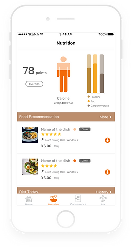
Nutrition Checking
Before:
No way to know about it.
😶
After:
"I need more Protein today."
"Naturally, I become more healthy !!! "
😎


Task 3
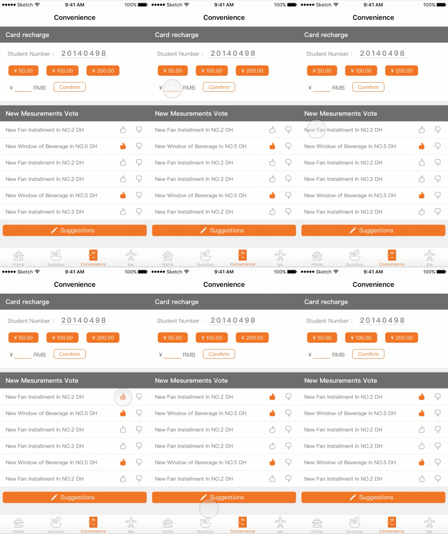
Card Charging & Feedback
Before:
1. Wait 10 minutes to charge dining card.
2. Have no way to give suggestions.
After:
1. only 1 minute in card charging and can pay online.
2. Can write to directors and own the right to vote for great suggestions.
In order to have a whole picture of students' eating in the dining hall (Usage Scenario), I wanted to know more about students' eating habits (the users) and the current problems they have (current condition).
The main research questions are:
1. How do students eat in the dining hall?
2. What are the pain points?
___
UNDERSTANDING THE CONTEXT
User Needs and Context
Questionnaire Research
173 students on campus participated the online questionnaire research.


Observation
I observed students' behaviors both as a group and as individuals.
Staff Interview
Through the interview of 4 staffs working in the dining hall, I gained more information about regulations there and the some of students' behavior patterns.

In-Depth Interview

___
PROBLEM
Dining hall experience is unsatisfactory
Dining hall plays an important role in Chinese universities, for almost all students live on campus and dining halls are the only option for students to have meals. However, as the rapid improvement of people's living standard, the current service of dining halls in university is not satisfying.
___
HOW'S CURRENT CONDITION
An uninformed student stay 30 minutes in a crowded space
After the comprehensive research, I mapped out a typical user journey as below to help broaden my ideas and guide my further design.


1. Time-consuming process
Typically, a student needs to stand in a line for 25 minutes to buy food. It is an extreme waste of time.
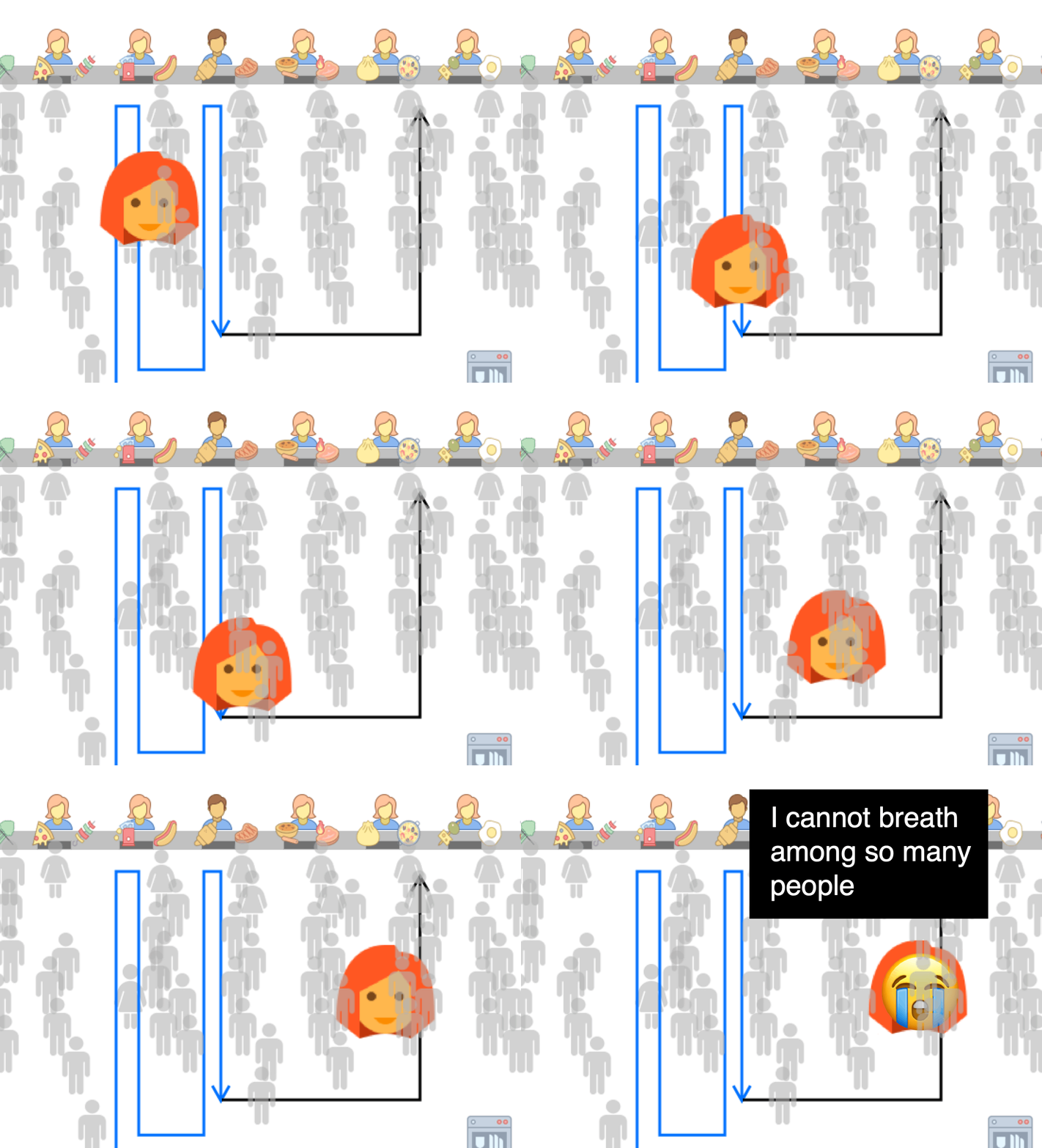
2. Crowdedness
Students felt uncomfortable when they stand to each other so closely, and have to shoulder their way in and out.
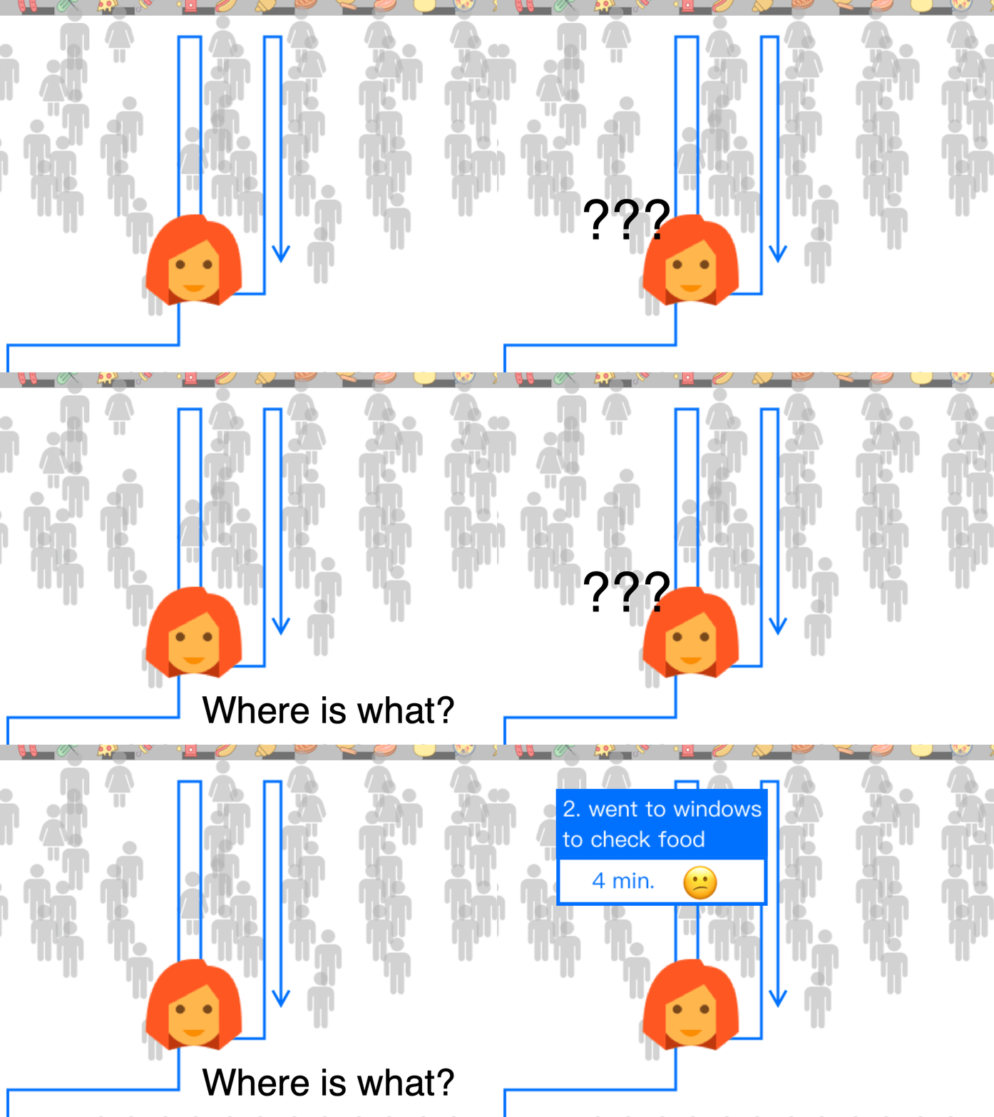
3. Lack of information
Students know nothing about what are the dishes provided in different dining halls and how's their flavor. Normally, they just randomly pick a dish but they don't like that.

4. Health concerns
Students have concerns about their diet structure, and they hope there is a way to track their food intake and get recommendations.
___
PAIN POINTS

1. Time-consuming process
Typically, a student needs to stay in the dining hall for 30 minutes to buy food. It is an extreme waste of time.

2. Crowdedness
Students felt uncomfortable when they stand to each other so closely, and have to shoulder their way in and out.

3. Lack of information
Students know nothing about what are the dishes provided in different dining halls and how's their flavor. Normally, they just randomly pick a dish but they don't like that.

4. Health concerns
Students have concerns about their diet structure, and they hope there is a way to track their food intake and get recommendations.
___
DEEPER INSIGHTS
What leads to these problems?
After the analysis of these problems, I found that they are closely related to each other. The core problems behind these pain points are:
1. Students swarm into the dining hall at the same time;
2. The process of buying food is not efficient enough;
3. Students need more information about food.

Large number of students
1. Set different time for classes to end, thus student flow can be divided;
2. Inform students of the current condition in the dining hall, so they can choose to go there when there are fewer people.
11:50
12:00
12:10
___
SOLVE PROBLEMS

Display the dining hall people flow condition in digital devices.
Students:
"I am not going at this time!"
The process of purchasing food is inefficient
Current Process
I drew out the process of buying food, trying to find opportunities in the frictions.
Designed Process
To smooth the process, I decide to remove the cognitive load for dining hall staffs and give to digital systems. In this way, restaurant staff don't even to knwo what the dish is, she can still do a great job in a short time.


After deciding the physical user journey, I come to the digital one
___
DEFINE FUNCTIONS
Design by Card Sorting
To make sure the information architecture suits users’ mental model and of higher learnability, five students were given the basic functions of this app and asked to classify these functions.


Students classified functions according to their mental model
According to users' understanding and expectation, the functions of the app are classified as below.
%20(1).png)
___
HOW USERS LIKE IT?
In order to quickly test the idea with users, I created a functional prototype, which is based on papers.

Prototype Version 1.0

Prototype Version 2.0
Then I asked 5 students to accomplish major tasks on the paper prototype to do the usability test.


Findings in the testing:
-
The warning of allergen can be easily neglected. That is dangerous.
-
When users want to select a dish from daily recommendation, they need to click into it to check its location. Location is important information for them.
The later iteration were conducted according to these feedbacks.
___
MAIN FLOWS
Food checking and ordering, nutrition checking, convenient dining hall service

___
TASK 1
Order Dishes Ahead of Time
The new experience helped users to check dish information, to order food ahead so to save time.


___
TASK 2
Track Nutrition Intake
By ordering online, users can easily track their nutrition intake and make adjustment to their diet accordingly. It also helps students to solve the headake of thinking about what to have for meals.
___
REFLECTION
Onsite research or even living in the context can be the best way to learn users' pain points
When I was designing NEatU, I can feel it clearly that, because of my understanding of the whole process and empathy to students, the design is deeper and more suitable to the context. That empathy cannot be acquired from simply a focus group, an interview or other research tools. It needs the experience. So I believe onsite research and the experience of living in the context can be the best way.
___
FINAL DESIGN
Main Page UI Design
The problems found in the testing were solved.
